Tuesday, 30 July 2013

Adding other materials

Working in my sketchbook I experimented with preparing a vaiety of textured grounds.


Starting with simply using PVA glue and tissue paper, I applied colour washes over the dried surfaces to enhance the texture. This was followed by applying medium thickness acrylic gel medium mixed with acrylic paint that I dragged and combed with tools and card.


Trying a board support, I then experimented with found materials mixed with PVA glue. In order to give myself some structure I visualised a still life group before applying the materials to the support.


Going back to my sketchbook and working with my garden as a theme, I prepared a collage from a mixture of photos and cut out shapes from old magazines and coloured paper. The focus was a sculputured head I had produced of a life model some years ago in a life class which I moved around my garden to get some inspiration.  


Building on the collage approach, I took an urban jungle theme for my next experiment working again on a board support. Using images and blocks of text cut from old magazines, I used my memories of working and travelling in London to create an expressive work enhanced with acrylic paint to give depth and atmosphere. The final work was treated with an acrylic gloss medium to protect and bind the surface of the collage.  


Moving onto mixing various materials into paint I gathered up some sand, sawdust and straw which were then used in an expressive landscape still working on a board support.


Through these exercises I have discovered that PVA glue and acrylic mediums in association with found materials can provide endless fun and fantastic scope for infinite textural effects which can enhance the impact of works. I particularly like the expressive nature of applied materials and how textures have a habit of caputuring light and enhancing shadows in unplanned ways. I have also used these exercises to trial the use of wood based boards as supports. Being more rigid than paper based supports, the boards have taken heavier materials such as sand and enabled thicker surface textures to be formed.

I have found that working with mixed materials has loosened my approach and encouraged me to be more expressive. I feel that at last I have discovered the true versitility of acrylic medium and associated support gel mediums. These exercises have given me a taste for working in mixed media an approach I intend to explore further.

Sunday, 9 June 2013

Part 5 - Different ways of applying paint

Exercise impasto

For the first two exercises I changed my normal support material from paper or mountboard to hardboard and plywood. These supports were prepared with a household paint emulsion to seal the timber fibres.

To increase the body of the acrylic paint I mixed it with a gel medium. This helped to maintain a sufficiently thick layer of paint as I applied course marks with medium sized brushes. I found that brush marks still had a tendancy to smooth out the paint and easily enabled a degree of blending on the support. I was not satisfied with the colour rendering of the pear which highlighted my tutor's comments regarding recreating seen hues. As a result and as a side execise I have gone back to some basic colour mixing exploration. However, I was pleasantly surprised by the impact of the apples painted in this looser courser manner.


I have already experimented with painting knives in earlier exercises so had some fun with this exercise. Initially I applied a glaze by mixing a blue acrylic paint with glazing gel. The painiting knife enabled me to create a wave inspired pattern as the glaze was scraped across the plywood surface leaving thicker/denser edges as the blade was lifted from the support. While the paint was still wet, I scratched some marks into the surface with the edge of a painting knife exposing the white under paint. Once dry, I added a small amount of unmixed colour with a different shape of knife. I particularly liked the effect created with the glazing gel where the paint has picked up the texture of the support resulting in different density of hue.


Returning to a watercolour paper support for the next exercise, I used a medium thickness gel medium mixed with acrylic paint. I started by applying the paint with old business cards and then dragged through patches of colour across each other creating broad areas of blended colour. While the paint was still wet, I added some additional paint onto the surface then dragged these into each other and the underlying paint using a plastic comb. This created peaks and troughs in the surface which dryed hard due the acrylic gel medium.


Reflecting on previous work I can see opportunities to enhance my paintings by applying these techniqes. For example the first exercise above using impasto with brush marks could be applied in portrait painting to free up my approach and capture a geater range of hues paticularly in skin tone. Similarly I can see the potential of using palette knives and glazing technques to create greater depth and interest in landscape, townscape and seascape studies as well as in still life work. The same can be said for applying scratching techniques. I feel that all approaches but particularly the last two exercises could lead to more spontaneous and serendipitous outcomes.
  
Exercise dripping, dribbling and splattering

This exercise was pure play and, I discovered, that this was obviously what I had been saving all my old decorating media for. Using wallpaper lining paper as a support and a mixture of ends of household gloss and emulsion paints, I dripped, dribbled and splattered from ground level and via a step ladder. The range of hues was restricted in this example to available old paint. However, the outcome was interesting and the process cathartic! The types of mark were influenced most by the properties of the paint and the force applied to move the paint from  various sticks onto the support by dropping or flicking from various heights.


I repeated this exercise at a smaller scale, in my sketchbook, using acrylic paint mixed with a clear tar gel medium. Using Series 3 Daler Rowney acrylic paint, the mixture did not flow off the painting knive as readily as I had expected and not as running as household gloss paint! I was able to drag and lift thin lengths of paint from blobs and smear the mixture across the support. The mixture dried with a gloss finish and textural thickness.


Looking at examples of work by contemporary artists' in various small galleries, I have noted that some have used these techniques sparingly to express movement, lighting effects, or the random planting of wild flowers in landscapes. It appears to bring a degree of serendipity into their work and provide an impression of the atmosphere of their subject matter.

Research point:

American Abstract Expressionists and European Tachist artists appeared following the World War 2 period. This "action painting" approach of working straight onto the support surface with bold expressive, energetic marks enabled an emotional reaction, idea and/or response from the artist to evolve without any specific reference to or attempt at illustrating reallisticaly a single observed subject. From my initial observations of works by artists such as Hans Hartung, Franz Kline, De Kooning and Jackson Plock, together with my experiements decribed above, I can appreciate the appeal of just allowing something evolve somewhat intuitively as serendipitous marks are developed.  I particularly like the mark making and associated textural qualities of Hans Hartung's work and note that Franz Kline found household paint more fluid and therefore suitable to his approach than fine art quality paint (as I have now discovered).

I feel that by continuing to experiment with a more expressive approach may help me to loosen up my own style taking me beyond my comfort zone of expected outcomes and lead to more interesting works. Looking back at my sketchbooks, it is those situations where I have just spread paint either from rubbing my old palette onto the page or using up left over paint and letting the colours mix by chance that I have produced more relaxed sketches/studies.

Friday, 8 March 2013

Part 4 Looking out - Landscape research

Principle reference sources:

Forrer, Matthi (2004), Hirosshige - Prints and Drawings, Prestel

Gombrich, E.H. (1995), The Storey of Art (16th Ed.), Phaidon Press Ltd

Heine, Florian (2012), Art the groundbreaking moments, Prestel Verlag

Koja, Stephen et al (2006), Gustav Klimt Landscapes, Prestel

Padberg, Martina (2008), Impressionism, h.f. Ullman

Pery, Jenny (2005), Eyton's Eye - Anthony Eyton: A Life in Painting, Royal Academy Publications

Visits the the National Gallery, the Coutard Gallery, Tate Britain and Tate Liverpool

Various web sites including those of the National and Tate Galleries. 
I started this blog in Nov. 2012 and have kept it open throughout this section of the painting module as I have continued to come across new examples of work that have been of interest.

My journey began with some images of the Japanese artist Utagawa Hiroshinge (1797-1853) whose prints I have been interested in for some time and contrasted this with a look at a contemporary perception of landscape in the yellow pages adverts. From here I took a more academic approach. I researched via an initial desk top study of readily available reference sources (see above) followed by a visit to the National Gallery in London where I collected some examples that expressed my understanding of early western development in landscape painting.
This took me through a period from the 17th century to early 20th century. I selected examples by Hendrick Avercamp (1585-1634), Meindert Hebbema (1638-1709), Canaletto (1697-1786), John Constable (1776-1837), JMW Turner (1775-1851), Camille Pissarro (1830 - 1903), Claude Monet (1840-1926), Vincent van Gogh (1853-1890), Paul Cezanne (1839-1906) and Akseli Gallen-Kallela (1865-1931). I liked the storey value of the Avercamp with the imagined illustration created from detail studies of people and places. The winter scene too created both a historical and emotionally charged atmosphere. Hebbema's and  Canaletto's views were fundamentally single point perspectives using man made structures (i.e. road and canal respectively) drawing the viewer's eye into and around the pictures. Canaletto's style was very precise almost photographic creating a completely different feeling of light and space to the Avercamp and Hebbema works. Constable's style appears more relaxed to that of Canaletto and more in keeping with the nature of the English landscape. Constable's composition and skill at colour mixing produces a realistic scene that can still be glimpsed today.

JMW Turner's work is much more atmospheric than the earlier artist's approach. His study and representation of light and movement removed the need for the addition of fine detail to be replaced by the application of colours to create suggestions of shape and form. Tate Britain provided an opportunity to view sketchbook studies by JMW Turner and note how he modified his palette of colours as he experienced the different light conditions at various locations across Europe. Turner's sketchbooks contain many examples of watercolour studies of skies as he experimented with capturing observed atmospheric conditions. Claude Monet' impressionist style also captures atmoshere and a sense of place. Working "plein air" enabled Monet and the other impressionist's to observe the changing light conditions as they worked which they reproduced in broad brush marks and the new tube paint colours.

Vincent van Gogh's expressionist approach conveys energy. His use of bright colours and strong textural marks have feeling and produce an emotional reaction. I enjoy his work and manner in which he distorts reality. When looking at his work it often raises the question in my mind of "where does drawing stop and painting begin?". There is obviously an overlap and van Gogh appears to span this zone. Paul Cezanne although of the same generation as the impressionists, developed his own approach independent of others. Gombrich in his "The Storey of Art" suggests that Cezanne questioned the impressionist approach "Where was that striving for a harmonious design, the achievement of solid simplicity and perfect balance which had marked the greatest paintings of the past?". His work appears flat and patterned but still manages to convey a feeling of place. His mark making/brush stokes although defined are in my mind more painterly than drawn as in van Gogh's work.
In the example of Camille Pissarro's work I have selected he has used the impressionist approach to reproduce a wet evening townscape. He has taken an aerial perspective view looking down into the Paris street below the viewer's eye level. Again the impressionist approach has captured the atmosphere of the place without the need for fine detail. A more serene view has been produced by Akseli Gallen-Kallela of a still reflective lake. Here a realistic view has been recreated with a calm and cool atmoshere. The artist has chosen a high horizon which helps to emphasise the vastness of the lake.


In addition to the Tate Britain exhibition of Turner's studies, a visit to the Coutard Gallery enabled me to inspect the exhibited "plein air" studies by Georges Seurat (1859-91) using oil paint on small boards. Both these exhibitions helped to appreciate that experimentation and studies are for the artist's personal benefit. They are not intended to be finished works or for public display. They are a place to explore, play and challenge. With this in mind I am attempting to expand my sketchbook mark making to contain a higher percentage of experimentation and observation than complete pictures.

As I have progressed through the exercises in Part 4, I have gone back through examples of other artists' work I have acquired from earlier exhibitions, I have attended new exhibitions (e.g. Tate Britain's exhibition "Looking at the view", Feb 2013) and investigated artists that I have become aware of. Within that list are examples by Spencer Gore, L.S. Lowry, Julian Opie, David Hockney, Gustav Klimt, Anthony Eyton and Ton Schulten.

I enjoy Lowry's work which although often of bleak views make me smile at his somewhat naive approach. In this river scene he has created a feeling of depth through his use of colour, fading it into the distance and by reducing the scale of buildings as they recede into the background.

The manner in which Spencer Gore had abstracted the observed shapes in the landscape around Letchworth in Hertfordshire attracted me to this example of his work.  Comparing this with the contemporary interpretation of a landscape by Julian Opie, there is more detail and feeling of energy in Spencer's image. Opie's minimalist approach and choice of hues in his print creates a feeling of peace and calm.

Anthony Eyton appears to be able to capture the light and atmoshere in his landscapes. His style appears to be impressionistic in approach using broad brush marks denoting shadow and tonal variations caused by the sun and reflected light. David Hockney has used the route/road theme over the years as a key compositional feature. In his exhibition at the RA "A bigger picture" he demonstrated how his approach has changed over his lifetime to date and how his technical ability can be applied through the use of linear and aerial perspective.


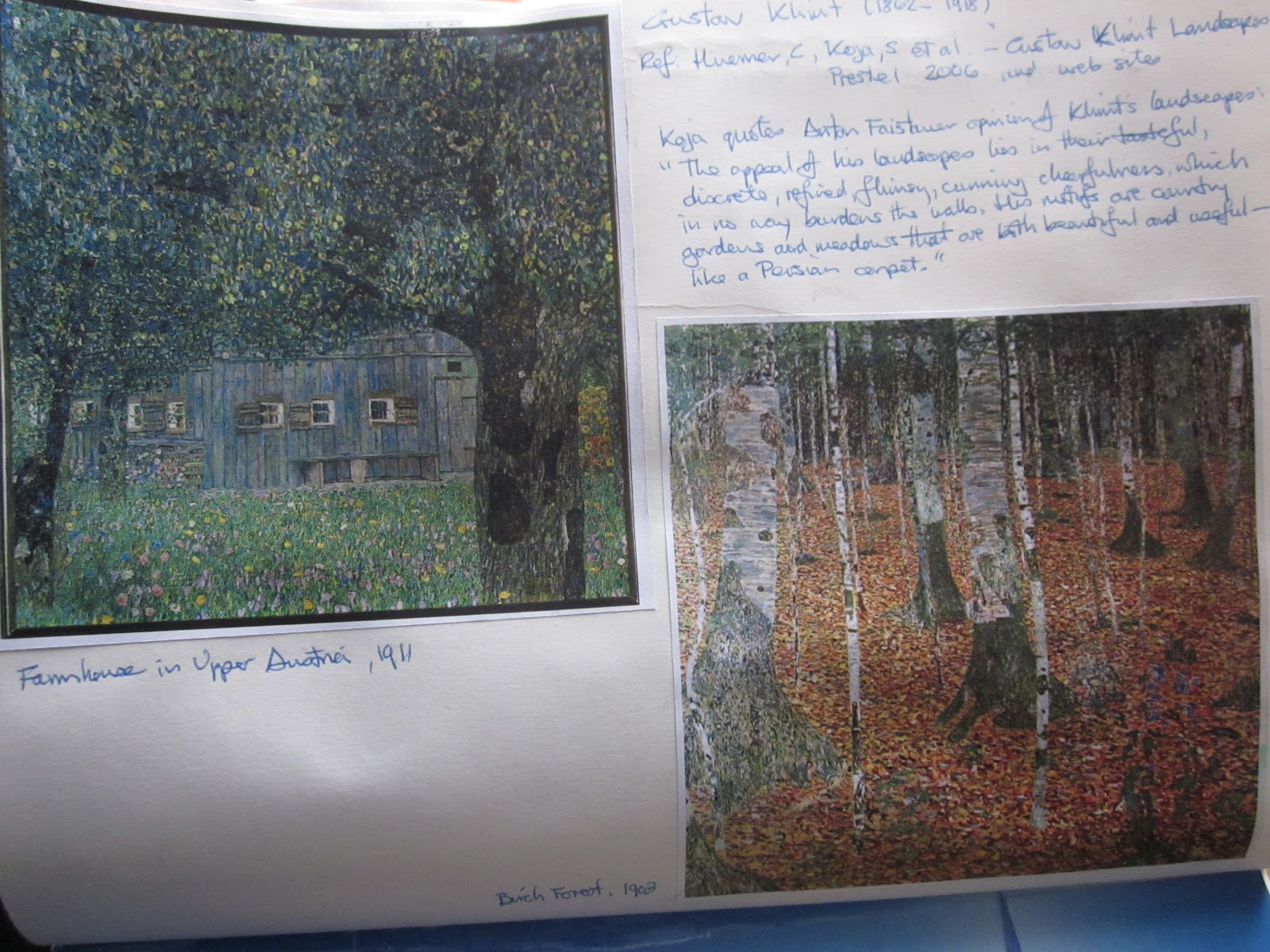
Gustave Klimt and Ton Schulten are two artists that were brought to my attention through my wife's textile work. Both artists use colour in exuberant ways with Klimt's eye for detail contrasted with Schulten's focus on imagination and pattern. I like the expressionist approach of Klimt which is in my view is more painterly than van Gogh's strong marks.

It is clear to me from my research to date that there are infinite opportunities presented to the artist to exploit the way that human brains try and link images to individual's experience of seen objects/views. Thus a painting whether it be an artist's illusion of reality, a dream or an idea may be enjoyed as pure pattern, juxtaposed colours and/or representation of a real place.


Wednesday, 6 March 2013

Assignment 4 - Looking out into my garden

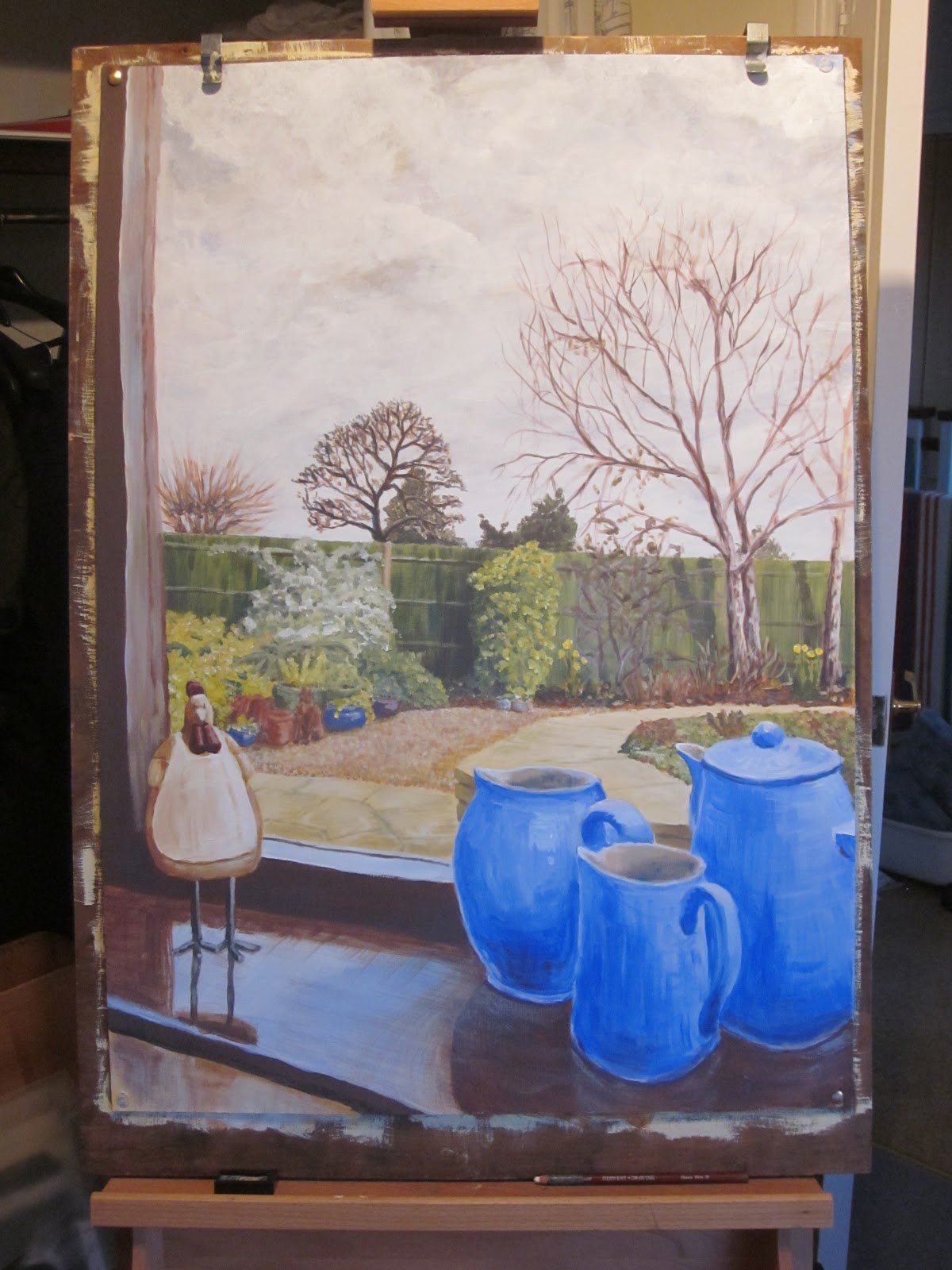
I have found the exercises that incorporate both inside and outside spaces together most challenging due to the contrasting lighting effects so I have chosen a view out for the final assignment piece. I have been inspired in my choice of approach by the work of Antony Eyton RA (ref: Pery, J., 2005, Royal Academy Publications and web sites). Although know as a figurative painter, the examples of Eyton's work that interested me most were of roofscapes seen through windows, his ability to both contrast the light between inside and outside space and balance colour across the view were concepts I wanted to explore in my own work.


Having experimented with views from windows both at home and in other buildings, I decided on a view from my conservatory into my garden. In order to help define the inside space I chose a view that Incorporated still life subjects on a window sill in the foreground building on experimentation from Part 2 of the Painting 1 module. I used both sketching and photographic images to assist with capturing a more interesting view i.e a child's eye view.


Starting with a landscape orientation I worked up a colour study but was not comfortable with the way that the window frame appeared to cut the image in two.


I then produced a series of thumbnail sketches with a portrait orientation changing the view point and sketching medium to get a better feel for the overall composition.


Once I was satisfied with the view that would provide an interesting composition, I used a photo to help scale up the image onto a prepared 600 mm x 840 mm mount board support.


Working across the whole picture I blocked out the main colour areas with lightish washes. Again, as suggested by my tutor, I have limited my palette. This time I have used titanium white, cobalt blue, cadmium yellow, yellow ochre and cadmium red.


I then worked on the sky creating a more dramatic winter cloud effect that was visible as I painted. From there I started to modify the reflected light on the window sill and strengthen the fence and associated shrubs in the middle distance.


I continued working on the foreground and middle distance gradually developing the contrasts and reflected surfaces.

Prior to developing the birch trees in my garden, I prepared a quick colour study in my sketchbook.


Comparing my painting with the actual view I noted some adjustments that were needed prior to adding reflections in the window.These included the orientation of the window sill edge and mother hen as well as lightening the surfaces in the middle distance and cooling the colour of the fence which I achieved by applying a blue wash.


By adding the reflected images in the window pane I have attempted to create a feeling of separation between the inside and outside spaces.


I was fairly pleased with the final composition. I felt that the gap I had created between the mother hen and group of jugs on the window sill helped to move the viewer's eye into the painting. The viewer's eye could then follow the diagonal lines created by the paved and gravel surfaces around the low wall towards the trees and flower beds. During the painting process, I found that each time I returned to my painting I discovered something else I wanted to modify either in terms of detail or hue. Eventually this seemed like fiddling/over working certain areas. Part of this re-adjustment process was due to the changing light as I worked over several days. Some of the re-adjustments were the result of mark making without checking the observed view.

Working to a larger scale introduced issues of scaling, colour mixing and coping with light variations over a period of days. I also noted that I continued to add fine detail with small brushes and despite using Anthony Eyton's work as a guide, I failed to adopt his approach of broader more expressive brush strokes. If I were to repeat this work, I would try to limit myself to larger brushes and attempt to work a arms length to create a more expressive response to the view.

Saturday, 2 March 2013

Expressive landscape

Throughout part 4 of the Painting 1Module I have been collecting views of the landscape around my village in sketchbooks and via photos. This together with my research into other artist's work and associated gallery visits have provided a wealth of images and memories from which I could draw on for this exercise. I was pleased that I had left this exercise until after painting a rural landscape and the exercise with using photos and sketches because I had been able to expand my awareness of landscapes and their representation by other artists.


I was inspired by two artists whose works were displayed in the Tate Britain exhibition "Looking at the view", i.e. Spenser Gore (The Beanfield, Letchworth 1912) and John Nash (The Cornfield 1918). These together with works by David Hockney I had viewed at his exhibition at the RA were in my mind as I approached this exercise.


Whilst preparing sketch studies based on local views, I was introduced to the work of Ton Schulten by my wife through her interest in textiles. Although not directly inspired by Schulten, I was interested in his use of colour, imaginative approach and simplification/abstraction of shapes. 


Going through my sketchbook images I selected two that provided most inspiration for my work on expressive landscapes. One image is a view looking away from Friendless Wood to the NW and one looking back in a SE direction towards Friendless Wood with power lines in the distance. 


I wanted to express the curvaceous and bright nature of my local landscape. Even though it was winter-time, new crops were starting to sprout green and chalk lightened ploughed fields reflected the weak winter sun. I began by experimenting with a series of thumbnail sketches trying out different degrees of curvaceousness and some colour variations.


In order to encourage a simplified approached focused on principal shapes, I prepared a study in collage using blocks of colour cut from old magazines.


I transferred this concept onto an acrylic paper support exaggerating the curves of the fields either side of the valley. I added some colour variation to express both tonal and vegetational differences. I was quite pleased with the finished effect although I did add more detail than originally intended principally in the form of the tree in the middle distance and texture in the foreground. By lightening and cooling the hues as they expressed areas that receded into the distance I believe I managed to create a feeling of perspective whilst the style was more relaxed and expressive than my perspectives of street scenes in earlier exercises.


Working from drawings and photographs

The snow during this winter and Assignment 4 period created both an opportunity to find some dramatic views and restricted on site painting. The example I have chosen to use here would have been difficult to produce in situ due to the cold and snow storms at the time. A popular walk from Flamstead towards the next village of Markyate goes across some open fields climbing up an incline at the boundary of two fields passed a lone oak tree.


As I walked across this field one morning the sky darkened ahead of a snow fall creating a wonderful contrast between the darkening sky and snow covered fields. The snow was broken by foot marks, paw prints, crops and vegetation. I was able to make some quick sketches on site supplemented by some digital photographs.


I chose one of the photos I had taken in landscape orientation. From this I prepared a colour study initially using ultramarine, yellow ochre and titanium white but felt the blue was too warm/red. I, therefore, decided to change the ultramarine for phthalo blue (phthalocyanine) when I worked on the actual painting.


To aid enlarging and transferring the photo image to an acrylic paper support, I squared up a print of the selected photo which I had fixed into my sketchbook.


The chosen composition approximately complied with the rule of thirds. The horizon was set at about one third of the way down from the top of the support. Blocking out the sky and snow covered fields quickly established the visual contrast I had experienced as the snow storm approached.


Keeping to a very limited palette of colours and using the scaling grid I added the tree and scrub line directly to the support with brush strokes. I added a light blue/white wash to the fields to indicate areas of shadow. I then built up detail adding crop rows and tonal detail to the scrub line. I created an impression of the snow covered branches and added dark marks where foot prints etc had been formed in the snow. Both the crop lines and foot marks helped to define perspective and lead the viewer's eye into the picture.


In producing my impression of the photographic image, I modified the colours and strengthened the contrast between sky and the fields to recreate the feeling of drama I had experienced in situ. My painting shows less detail and emphasis on the marks in the snow in the foreground than the photo but has a greater emotional impact.