Friday, 17 August 2012

Portrait - conveying character

I decided to work from photo references for this exercise having discovered how difficult it is to capture a smile when working from life. Continuing a theme of using family members and their partners as source material, I have used my son's fiance as the model. My aim was to capture her open expression.

In an attempt to identify key features that expressed that part of her character, I prepared some studies using tracing paper and pen. To bring these sketches alive I added colour to the back of the tracing paper so the pen marks would still be visible. The result was cartoon like images with the pen marks too even and not differentiating/subtle enough. I then worked in pencil using different views trying to identify tone. I found the top left image most life like as I had taken more trouble over measuring proportions.

From these preparatory studies I felt the frontal pose expressed the character best. Using my sketch book I checked my proposed composition and tonal intentions.

Working on a prepared acrylic paper support, I sketched out the portrait with burnt umber washes indicating tonal variations. I found that this looser style of setting out the portrait with washes was freer and flowed better than working with undiluted pigments on a portrait sketched in chalk, as I had with my last exercise. Continuing to use washes I started to add skin and hair colour then worked on the clothes and background.


In order to improve the contrast between the portrait and background I over-laid ultramarine to the earlier background washes, mixing white into the blue where I wanted to lighten the tone. I was then able to start adjusting the portrait hues from hair to clothes bringing out greater depth and contrast.

The skin tones were the last to be adjusted. I have found that by leaving my paintings for a few days before the final washes and marks are added I have time to compare my draft work with the reference pieces and enhance tonality and expression. The result shown below has produced more depth to the face, better tonal representation of the hair and life to the eyes.


Comparing my head and shoulders portraits, I found the last two exercises most successful. I believe I had achieved more confidence by this stage in mixing skin tones and drawing directly onto the support in light washes. Also being restricted in available time to work from life, I have found the use of photo referencing suits my circumstances and allows greater opportunity to capture fleeting expressions or to exaggerate features. Technically the changing light and sitter's comfort working in natural daylight from life was very challenging particularly as I feel self conscious of my slowness whilst I build confidence with colour mixing and my mark making.

I have observeded other artist's work at various galleries, in books and on-line during this project and am still discovering different, new and interesting expressive techniques I intend to experiment with as time allows. I have captured some examples of these works in my sketchbooks for inspiration but accept these are only limited reproductions of the original works. I have yet again experienced why some artists can spend a lifetime studying and exploring a single theme.

Thursday, 26 July 2012

Portrait - creating mood & atmosphere


In preparation for this exercise I made reference to works by other artists i.e. Monet, Modigliani and Picasso.

I particularly liked Picasso's "Girl in a Chemise" and Modigliani's "Portrait of a young woman seated". Using my wife as my model I produced some pastel studies in my sketchbook inspired by these reference pieces. I wanted to create an image that expressed happiness/cheekiness without being completely true to life. I wanted to use a pose similar to Modigliani's but employing a dark background as used by Picasso.

I liked the joy, warmth and happiness expressed in the image of my wife wearing a wig (figure on the left). However, I was attracted to the cheekier image on the bottom right created by elongating my wife's shape and stylising key features.


I played with this idea creating a rough collaged image. Before proceeding further, I decided to research Modigliani's work and in the process came across a study of Vogue covers (Packer,William: The Art of Vogue Covers, 1909 - 1940) which included examples by Helen Dryde, Lepape and Benito produced in the 1920's where features had been elongated. I produced some reference sketches of both the Vogue images and works by Modigliani from 1917-1919.


Working with a photo reference, I experimented with the elongation of my wife's features based on the Modigliani pose above (except in my version the left hand is on the right breast).

Having enjoyed producing the collage, I decided to work in a mixed media format for this exercise using mount board as a support. Prior to setting out the image on the mount board, I referred back to some earlier tonal studies using side light from a north facing window.


I then marked out the approximate position of the image on the mount board support using a chalk pencil indicating where the highlighting would be. Tissue paper was then applied with PVA glue and allowed to dry before applying a base layer of white household emulsion paint mixed with acrylic paint.


I used a green acrylic paint for areas that would be exposed skin. I applied a purple background and then started to work up the hues of the portrait. I realised that although purple had looked fine in my earlier pastel sketch, now that I was using slightly different hues in acrylic colour the skin tones were not contrasting sufficiently with the background. I referred back to Ostwald "The colour primer",Van Nostrand Reinhold, 1969 recommended by my tutor in order to re-assess colour contrasts and chose to replace the purple with a blue green. I also adjusted the expression of the face, slimmed and emphasised the muscles in the neck and thinned the hand and fingers.

I am pleased with the expression and overall effect of the final piece which has achieved what I had set out to create. The colour of the lips are less pronounced than I had intended but they seem to work in an under-stated way. I have tried various skin tones as I have worked up this portrait and in future intend to experiment with colour mixes prior to starting the final painting. I prepared some pencil studies of hands but working in paint is more complex and needs some more practise to achieve something more life like. I enjoyed creating the textured surfaces with tissue paper and creating highlights/grey tints to the hair by running a painting knife over the textured surface.

Tuesday, 3 July 2012

Head and shoulders portrait

I started with my wife acting as my model, preparing a number of study sketches before setting up a pose for the portrait.


I then tried out a colour and composition study again in my sketchbook. This study was completed in one sitting but I took a photo for reference purposes enabling me to reposition my model after breaks. This first colour study produced an image that appeared to age my wife but we are still talking! I had prepared the support with an ochre wash onto which I built layers of acrylic using brush marks. The finished image was flat, the lower face proportions were too narrow and the whole image felt lifeless.


For the next piece I worked on an acrylic paper support that I had prepared with a mix of white emulsion paint and green acyclic paint. I outlined the portrait with washes before adding layers of colour with brushes. Then to create more life I started to work with painting knives building up thicker and rougher marks.

To get maximum light and give my model a comfortable pose, I set up this portrait in my conservatory. I worked for about 2 hours with breaks before I reached the stage in the right image above. I was not satisfied with the shape or proportions of the eyes or mouth and was struggling with colour matching as the light changed as the sun moved round and the paint dried to a darker hue than when wet. I took some photos for referencing and left the portrait for a few days before returning to it. 


When I went back to this portrait I worked in my studio using the reference photos. Working with filbert brushes, I lightened the skin tones and built up the detail to the background and clothes. I also improved the proportion of the lips and shape of the eyes and nose. I took breaks to allow the paint to dry and reach its final hue and periodically I checked the painting against my actual model as the photo's do not reproduce the skin tones very well. I still seem to have aged my wife in the portrait but am more satisfied with this image than the earlier study.

I am not satisfied with the accuracy of the eyes and matt finish of the raw acrylic paint and may experiment with applying a glaze of acrylic gloss medium over the whole picture. I prefer the additional texture provided by using a painting knife but this has produced a less realistic finish to the skin areas which are soft and smooth in life. It has helped, however, to distinguish between the focus of the picture and the surrounding details. I find the darkening of the acrylic hues on drying frustrating as I struggle to achieve the colour matching I am looking for. I am learning to take breaks to allow the drying to take place before proceeding with new layers.

To experiment with capturing a more natural smile, I worked up a soft pastel sketch of my daughter from a photograph. The photo was adequate for capturing the pose but had limitations in assessing skin hues.

Due to the time it takes me to complete a painted portrait and to create portraits that are  satisfying, I have discovered the advantages of mixing time with the model and studio work from reference photos. I have found that working with live models is far more challenging than still life both in terms of considering the model's comfort and capturing the colour variations on skin hues and tones. 

Monday, 2 July 2012

Self Portraits

I started sketching myself before selecting examples produced by other artists or comparing my approach to that taught by accomplished tutors. As a result my initial sketches are not porportionally accurate with some features exaggerated.

I discovered that I was capturing a staring pose, long faced with relaxed mouth. Being a mirror image I was also producing an image not seen by others with my bent nose pointing in the oposite direction to reality. The sketches helped to define tone and where to darken the background to enhance contrast. The proportion and shape of my face were not factually correct in the early images which I improved in the following sketch with glasses.

Prior to working in colour I made reference to other artisits' work I seen at prior gallery visits and from internet searches. I selected a range of examples of other artists' work I found interesting (i.e. Vincent van Gogh, Pablo Picasso, Lowry, Fiona Scott, Henri Matisse and David Hockney).


The portraits with simple backgrounds help to focus the eye on the person. In the Van Gough example the features of the room in the background add context as does the paint brush in the foreground of the David Hockney watercolour. The two ages of Hockney show both his developing style and confidence with mark making. Lowry and David Hockney have illustrated the wide eyed stare that painting from a mirror image creates.

When creating my own painted self portrait study, I worked from the eyes and mouth outwards thus improving the proportions of the final image. I worked with painting knives on the face to give texture when I put down middle layers before finishing with a filburt brush. My wife thought I had created a sad looking image that made me look 10 years older! I discovered how difficult it is to paint a smiling image as holding the smile for long periods is uncomfortable and leads to a false smile. The result is a more serious pose. I am pleased with the proportions and shape in the colour study portrait below but have over emphasised the redness of my skin colour.


Working on a contrasting green mid-tone support, I prepared a second painted image using brush maks only. Again I have produced an image with elongated features and an over rudy complecture. I feel I have caputured my eyes, forehead, hair and mouth well. However my nose is too long and my lower face too narrow. I believe the image is closer to how my father looks than me - perhaps a preminition of how I am going to age! By photograghing my sketchbook page in a mirror I have reversed the image on the right to appear as others see me.


I am impressed by the way the red tones stand out from the mid-green of the prepared support. I intend to play around with my own portrait focusing on key features similar to Matisse's approach.

Saturday, 5 May 2012

Observations of the human figure - 1

I have been looking forward to this part of the painting module. I find the representation of people in art and graphic design fascinating and would like to develop my own response to the shapes and movement I see around me every day. I perceive this part as an opportunity to explore the impact of my marks, colour, shapes and texture on a complex and varied subject matter.

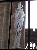
During a recent visit to Coventry I was inspired by the art associated with the Cathedral buildings particularly the sculptures and and glass engravings based on human forms. The scale and positioning of these works of art added to the visual and emotional impact. The choice of material be it stone, metal or glass provided opportunities and limitations which the artists had exploited.

When working in paint on a two dimensional surface an artist can exploit the two dimensions or through the use of tonal effects create the impression of a solid three dimensional person. At the Herbert Art Gallery & Museum adjacent to Coventry Cathedral, I came across two portraits by the artist John Howard Jepheott (1910-1984) which interested me. Both "The picture of a girl - the innocent" (illustrated here) and "Portrait of an intellectual",  painted in 1959, are angular portraits where colour variation contained within bold lines create interest within a predominantly two dimensional image.
My own initial sketches for this part of the course were prepared at a local art group evening with a professional life model. Short pose pencil sketches were followed by slightly longer poses that provided the opportunity to experiment with colour. The professional model was able to vary and hold poses with relative ease. However, the provision of the model at the evening event was a change to the published programme so I only had my A4 sketch book available to practice in.


Whilst progressing the course exercises, I have referred to John Raynes books "Complete Anatomy and Figure Drawing", Batsford 2007 and "The Figure Drawing Workbook", Collins & Brown 1997 as well as continuing my visits to galleries and searching examples of artists work on the Internet. My wife has been the principle subject for the exercises for which I am most grateful.

Pencil and charcoal sketches enabled me to observe structure, proportions, tone and weight. I find that using water soluble pencil provides the flexibility to move from line to tonal washes easily which suits life drawing. The need to fix charcoal, I find more limiting than pencil or pen work although the ability to achieve greater density of line and a range of soft tones means this medium can not be ignored. I used images of Euan Uglow's (1932-200) work as inspiration for poses suitable for my life model (i.e my wife) to hold comfortably.  

Having produced a number of quick sketches, I moved into experimenting with colour. I tried to contrast the warmer skin tones with cooler colours for areas in shadow. Each of the images below were produced in single, relatively short sittings using acrylic paint.

The study of the reclining nude enabled me to experiment with colour and brush marks. The work was completed in a single sitting and as such feels unfinished and flat. I have yet to decide whether to re-work over this initial piece as I am happy with the overall structure. The composition of the sitting pose does not feel as balance as I would like with the left foot sticking out. I have been freer and more expansive with my marks working in places with a painting knife. There appears to be more energy in this piece which again was produced in a single sitting fairly quickly.

At this stage I looked for more inspiration from the work of other artists and selected a few whose approach I found interesting.


I have decided to pause on this exercise whist I reflect on the study of other works and move onto the next exercise in the module before revisiting my study of the human form in paint.

Tuesday, 27 March 2012

Assignment 2

I chose to use the four man-made objects I had used in earlier studies for the still life subject of this assignment. I set up the objects in my studio placing them on a board on a table.

For my first study I prepared a collage with mono-chrome pen and ink background. In the image I tilted the board creating a false perspective and used magazine text to add tone to the board. I was pleased with the contrast between the coloured foreground and predominantly black and white background.


Using a pencil study in my A6 sketchbook, I worked out tonal qualities of the still life and the impact on its composition. I prepared the sketch from memory whilst travelling on a train into London.


I continued with a colour study in my approx A4 sketchbook returning to the blue and orange contrast combination I like. I used this study to experiment with applying acrylic paint to with a palette knife to add texture to the tall vase. I also experimented with acrylic gloss medium adding this to the "Mother Hen" and jug. By only using the gloss medium on two objects in the still life I discovered that the effect was to confuse the painted highlights from the reflections off the gloss medium.

I felt the view adopted so far was too similar to that used for earlier exercises so I changed my view point and working in my sketchbook produced a new line sketch to which I tried out colours.
Having decided on a the view point for my composition I proceeded to block out areas on my prepared support with acrylic washes.


I gradually build up the tones and hue mixes on the foreground objects. I wanted to maintain a warmth and true to scale proportions to the perspective overall. I also wanted to create a feel of interest beyond the view painted - what was behind the doors? what was Mother Hen looking at?

I, therefore, adjusted the doors so that the left hand door appear to be partially open and increased to brilliance of the table's orange finish. On reflection I realised the table's hue was drawing the viewers eye away from the main subjects. Also the tall vase appeared lost against the background.

I toned down the table to a more realistic colour and added warmth to the vase to help it stand out. I adjusted the hue of the vase further to increase the contrast between it and the jug by lightening the vase. Finally I modified highlights to the objects and added reflection to the picture in the background. I am particularly pleased with the quality of light that I have created within the picture.


By showing more of the room in which the still life was set up the composition has become busier and has created a storey beyond the man-made objects. As an illustration that effect may be useful. However as an image in its own right, I prefer the focus more on the sill life subjects as created in an earlier exerice. Framing the work helps to improve the focus too.

Compared to my work for Assignment 1, I believe I have improved the composition and my use of colour. I have stretched myself further too in exploring how to paint interior perspectives.