Wednesday, 6 March 2013

Assignment 4 - Looking out into my garden

I have found the exercises that incorporate both inside and outside spaces together most challenging due to the contrasting lighting effects so I have chosen a view out for the final assignment piece. I have been inspired in my choice of approach by the work of Antony Eyton RA (ref: Pery, J., 2005, Royal Academy Publications and web sites). Although know as a figurative painter, the examples of Eyton's work that interested me most were of roofscapes seen through windows, his ability to both contrast the light between inside and outside space and balance colour across the view were concepts I wanted to explore in my own work.


Having experimented with views from windows both at home and in other buildings, I decided on a view from my conservatory into my garden. In order to help define the inside space I chose a view that Incorporated still life subjects on a window sill in the foreground building on experimentation from Part 2 of the Painting 1 module. I used both sketching and photographic images to assist with capturing a more interesting view i.e a child's eye view.


Starting with a landscape orientation I worked up a colour study but was not comfortable with the way that the window frame appeared to cut the image in two.


I then produced a series of thumbnail sketches with a portrait orientation changing the view point and sketching medium to get a better feel for the overall composition.


Once I was satisfied with the view that would provide an interesting composition, I used a photo to help scale up the image onto a prepared 600 mm x 840 mm mount board support.


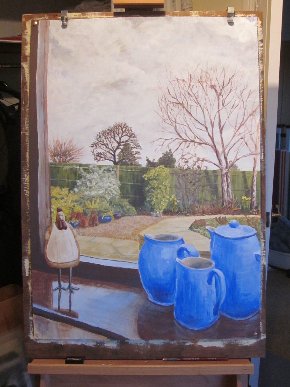
Working across the whole picture I blocked out the main colour areas with lightish washes. Again, as suggested by my tutor, I have limited my palette. This time I have used titanium white, cobalt blue, cadmium yellow, yellow ochre and cadmium red.


I then worked on the sky creating a more dramatic winter cloud effect that was visible as I painted. From there I started to modify the reflected light on the window sill and strengthen the fence and associated shrubs in the middle distance.


I continued working on the foreground and middle distance gradually developing the contrasts and reflected surfaces.

Prior to developing the birch trees in my garden, I prepared a quick colour study in my sketchbook.


Comparing my painting with the actual view I noted some adjustments that were needed prior to adding reflections in the window.These included the orientation of the window sill edge and mother hen as well as lightening the surfaces in the middle distance and cooling the colour of the fence which I achieved by applying a blue wash.


By adding the reflected images in the window pane I have attempted to create a feeling of separation between the inside and outside spaces.


I was fairly pleased with the final composition. I felt that the gap I had created between the mother hen and group of jugs on the window sill helped to move the viewer's eye into the painting. The viewer's eye could then follow the diagonal lines created by the paved and gravel surfaces around the low wall towards the trees and flower beds. During the painting process, I found that each time I returned to my painting I discovered something else I wanted to modify either in terms of detail or hue. Eventually this seemed like fiddling/over working certain areas. Part of this re-adjustment process was due to the changing light as I worked over several days. Some of the re-adjustments were the result of mark making without checking the observed view.

Working to a larger scale introduced issues of scaling, colour mixing and coping with light variations over a period of days. I also noted that I continued to add fine detail with small brushes and despite using Anthony Eyton's work as a guide, I failed to adopt his approach of broader more expressive brush strokes. If I were to repeat this work, I would try to limit myself to larger brushes and attempt to work a arms length to create a more expressive response to the view.

Saturday, 2 March 2013

Expressive landscape

Throughout part 4 of the Painting 1Module I have been collecting views of the landscape around my village in sketchbooks and via photos. This together with my research into other artist's work and associated gallery visits have provided a wealth of images and memories from which I could draw on for this exercise. I was pleased that I had left this exercise until after painting a rural landscape and the exercise with using photos and sketches because I had been able to expand my awareness of landscapes and their representation by other artists.


I was inspired by two artists whose works were displayed in the Tate Britain exhibition "Looking at the view", i.e. Spenser Gore (The Beanfield, Letchworth 1912) and John Nash (The Cornfield 1918). These together with works by David Hockney I had viewed at his exhibition at the RA were in my mind as I approached this exercise.


Whilst preparing sketch studies based on local views, I was introduced to the work of Ton Schulten by my wife through her interest in textiles. Although not directly inspired by Schulten, I was interested in his use of colour, imaginative approach and simplification/abstraction of shapes. 


Going through my sketchbook images I selected two that provided most inspiration for my work on expressive landscapes. One image is a view looking away from Friendless Wood to the NW and one looking back in a SE direction towards Friendless Wood with power lines in the distance. 


I wanted to express the curvaceous and bright nature of my local landscape. Even though it was winter-time, new crops were starting to sprout green and chalk lightened ploughed fields reflected the weak winter sun. I began by experimenting with a series of thumbnail sketches trying out different degrees of curvaceousness and some colour variations.


In order to encourage a simplified approached focused on principal shapes, I prepared a study in collage using blocks of colour cut from old magazines.


I transferred this concept onto an acrylic paper support exaggerating the curves of the fields either side of the valley. I added some colour variation to express both tonal and vegetational differences. I was quite pleased with the finished effect although I did add more detail than originally intended principally in the form of the tree in the middle distance and texture in the foreground. By lightening and cooling the hues as they expressed areas that receded into the distance I believe I managed to create a feeling of perspective whilst the style was more relaxed and expressive than my perspectives of street scenes in earlier exercises.


Working from drawings and photographs

The snow during this winter and Assignment 4 period created both an opportunity to find some dramatic views and restricted on site painting. The example I have chosen to use here would have been difficult to produce in situ due to the cold and snow storms at the time. A popular walk from Flamstead towards the next village of Markyate goes across some open fields climbing up an incline at the boundary of two fields passed a lone oak tree.


As I walked across this field one morning the sky darkened ahead of a snow fall creating a wonderful contrast between the darkening sky and snow covered fields. The snow was broken by foot marks, paw prints, crops and vegetation. I was able to make some quick sketches on site supplemented by some digital photographs.


I chose one of the photos I had taken in landscape orientation. From this I prepared a colour study initially using ultramarine, yellow ochre and titanium white but felt the blue was too warm/red. I, therefore, decided to change the ultramarine for phthalo blue (phthalocyanine) when I worked on the actual painting.


To aid enlarging and transferring the photo image to an acrylic paper support, I squared up a print of the selected photo which I had fixed into my sketchbook.


The chosen composition approximately complied with the rule of thirds. The horizon was set at about one third of the way down from the top of the support. Blocking out the sky and snow covered fields quickly established the visual contrast I had experienced as the snow storm approached.


Keeping to a very limited palette of colours and using the scaling grid I added the tree and scrub line directly to the support with brush strokes. I added a light blue/white wash to the fields to indicate areas of shadow. I then built up detail adding crop rows and tonal detail to the scrub line. I created an impression of the snow covered branches and added dark marks where foot prints etc had been formed in the snow. Both the crop lines and foot marks helped to define perspective and lead the viewer's eye into the picture.


In producing my impression of the photographic image, I modified the colours and strengthened the contrast between sky and the fields to recreate the feeling of drama I had experienced in situ. My painting shows less detail and emphasis on the marks in the snow in the foreground than the photo but has a greater emotional impact.

Thursday, 28 February 2013

Painting outside

I started this exercise in the autumn, ahead of the earlier exercise on expressive landscape, during a break in the wet weather and before the snow. In preparation I spent a few days sketching views as I walked the footpaths that cross the fields around my home village of Flamstead.


I finally settled on a location adjacent to Friendless Wood where a bench had been placed for locals and passing walkers to stop and enjoy the views. From this bench I prepared a pencil study in my A4 sketchbook and a watercolour study. The view I had chosen had diagonal lines created by the fields' boundaries and hedge rows together with receding power lines in the distance. These features should help to lead the viewer's eye into the composition of my picture.


The composition I created was loosely based on the "rule of thirds" and comprised elements of aerial perspective looking down into the valley in the middle distance. I liked the different textures created by the way the fields had been ploughed and the crops or grass were growing contrasting with the hedge rows/tree lines and man made structures (power lines). I wanted to express these variations to help enhance the feeling of space and distance.


Unfortunately, prior to returning to commence my acrylic painting in situ the weather changed again bringing more rain for several days. In order to progress this exercise I retreated to my studio with the studies I had prepared on site and attempted to reproduce the view starting with a colour study in my sketchbook.


At the time of my initial sketches the sky been fairly clear leading to frosty mornings. The hue was pale receding to a cool lemon/white near the horizon. The distant trees and power lines appeared a blue grey with the distant fields loosing their colour intensity. The sun was positioned above the top right of my view placing the hedge row in the middle distance in shadow and highlighting the brow of the field at the edge of the foreground as it fell away out of view.


I worked with a palette limited to ultramarine, lemon yellow, yellow ochre, cadmium red (dark hue) and titanium white. My first layer of colour enabled me to block in the whole view but with limited tonal variation. To strengthen the illusion of perspective I proceeded to lighten the background and parts of the middle distance and darken the foreground. I also defined the hedge rows and tree lines in a deep blue grey and started to differentiate tones on the small wood to the right of the view where the sunlight was catching the tops of the trees.


I took breaks between applications of paint to allow for drying and colour settling as the acrylics darken as they dry. I gradually adjusted the hues to increase the contrast between the lighter tree lines and fields in the distance from those in the middle distance. Working across the picture I also increased the level of detail in the foreground creating greater definition of the rough grass and ploughed field. At this point I added the power lines and telegraph pole.


As my first attempt at a rural landscape using acrylic paint, I was satisfied that I had managed to achieve some feeling of distance by varying the lightness and intensity of hue from foreground to background. I was disappointed not to have managed to complete the painting in situ but am motivated to try again when the weather improves. The result is less spontaneous and free than my watercolour study. Also my choice of colours was too limiting for this subject and could have been improved by adding a warm cadmium yellow and possibly another blue to increase the variety of mixed greens particularly in the foreground and to enhance the earthy hues actually visible in the fields.

I believe I could have improved the composition by adding more detail to the rough grass/wild flower area in the foreground and being more controlled with my rendering of the telegraph pole in the middle distance. Had I worked in situ the southerly aspect of the view may have caused problems as the sun moved across the sky changing both shadow/tones and the intensity of hues. The location was otherwise quite good being sheltered by the wood behind the view and because there was a bench available to sit on and lay out my materials. It is situated less than half a mile from my home in easy walking distance for carrying materials and supports up to about A2 in size.

Saturday, 23 February 2013

Project Perspective - The Three Blackbirds

Using my village as inspiration for the linear perspective exercise, I prepared some sketches of a local pub, The Three Blackbirds, and took some reference photos so that I could continue working in my studio as the weather was not conducive to painting outside.


From my architectural training early in my career and subsequent years of sketching, I am comfortable drawing linear perspectives of buildings. Previously I have produced painted works in watercolour or pen and ink with colour washes. For this exercise I was keen to stay with acrylics to develop my skills with that medium. I, therefore, added an acrylic colour study in my sketchbook prior to setting out the composition on paper. Following feedback from my tutor, I continued to experiment with a limited palette of colours mixing as necessary.


Working in my studio, I sketched out the composition scaling up the drawing from my sketches and photo references. I chose to use the natural white base of the acrylic paper support onto which I blocked in areas of colour using light washes.


Once I was satisfied with the proportions and overall composition, I built up the image working across the whole painting. I took regular breaks as I added colour allowing the acrylics to dry and reach their natural hue and give me opportunity to step back and check the overall impact of the part I had been working on.


Reflecting on previous feedback from my tutor regarding the visual impact of backgrounds and foregrounds to the overall picture, I concentrated particularly on the visual quality of hues in the sky and road surfaces.


As the work progressed I increased contrast between light and dark areas to enhance the feel of depth and perspective. I also used the diminishing scale of some figures walking away into the distance to emphasise the the illusion of perspective.

I was reasonably satisfied technically with the outcome although I felt I had over worked the pub's left. However, the composition was fairly typical of the views I have illustrated in the past and did not stretch me conceptually as much I would like. If I paint this or a similar subject again I intend to experiement more with distorted/bent perspective, play with a nieve aproach and create an abtract or dream like illusion. 

Having painted St.Paul's Cathedral, in the last exercise, in aerial perspective I chose not to practise this approach again here.


Wednesday, 20 February 2013

From inside looking out

Exercise:  View from a doorway

After some experimentation and reflection with views from different windows in my home, I settled on looking out from my utility room. I thought this location would be easier to work from in terms of making a mess and it produced some interesting shapes and perspective challenges.


From initial studies in my sketchbook, I discovered that the light changed dramatically as the sun moved into view and surface colour modifications became significant following rain (a common occurrence during this exercise!). Working on acrylic paper support, I sketched out the view in situ then added washes to block out main areas of colour. I found that despite initial assumptions that I could paint directly from the view, I was too cramped so completed the study in my studio. Due to the strong sunlight and reflective effect of wet surfaces following showers, I discovered that I needed to add high percentages of white to the pigments used to illustrate outside surfaces. Similarly the framing created by the back door frame was cast in shadow and needed to be sufficiently dark to create sufficient contrast. I continued this exercise until I felt I had understood the impact of sun and rain on colour representation then stopped before producing a final picture.


Exercise: Hard landscape

A view I have often sketched is from the members room at Tate Modern looking across to St. Paul's Cathedral. This view has many challenges from a partially looking down aspect, to a complex bridge and reflective effects from the Thames.

I prepared some new sketches in situ whilst at Tate Modern for this exercise. Working from these sketches and photographs, I started by using a composition comprising a full view from Tate Modern.


The view was almost an elevational image of the north bank of the Thames with the Millennium Bridge bring the viewer's eye into the picture. This study gave me the opportunity to try out colour mixing using a palette limited to titanium white, ultramarine, yellow ochre, lemon yellow and cadmium red. Brush control to create vertical lines and fussing over small details were my biggest challenges.


Having played with this composition, I decided to experiment with a study of a part of the overall view. Going back to my sketchbook, I tried out a composition that focused in on the drum of St Paul's. I used pages in my sketchbook that already contained colour I had spread from the ends of paint on a previous palette.


I was happier with this composition so enlarged it onto an acrylic paper support. I started by trying to reproduce the effect of randomly spread colour as a base layer. This was not as spontaneous as in my sketchbook and looked a bit manufactured. As I built up my composition over the prepared support, I started to loose the earlier marks due to the application of thicker paint layers than the glazes used in my sketchbook study.

I worked with a limited palette of ultramarine, yellow ochre, cadmium red (dark hue) and titanium white. In order to bring the composition back to my earlier concept, I added yellow ochre and cadmium red to the sky. I found that I needed to add a relatively high percentage of white to the yellow ochre to achieve the whiteness of the stone which was reflecting sunlight. I also had to darken the sky adjacent to the cathedral drum in order to create sufficient contrast and a feeling of depth.


I am happier with both the composition and colour choices in this painting than in the two earlier examples. Despite being almost elevational in view and simplified in detail, I feel I have captured the atmoshere and scale of St. Paul's Cathedral compared to the buildings in the foreground whist expressing the feeling of warmth and depth I observed in the prevailing sunlight.