Forrer, Matthi (2004), Hirosshige - Prints and Drawings, Prestel
Gombrich, E.H. (1995), The Storey of Art (16th Ed.), Phaidon Press Ltd
Heine, Florian (2012), Art the groundbreaking moments, Prestel Verlag
Koja, Stephen et al (2006), Gustav Klimt Landscapes, Prestel
Padberg, Martina (2008), Impressionism, h.f. Ullman
Pery, Jenny (2005), Eyton's Eye - Anthony Eyton: A Life in Painting, Royal Academy Publications
Visits the the National Gallery, the Coutard Gallery, Tate Britain and Tate Liverpool
Various web sites including those of the National and Tate Galleries.
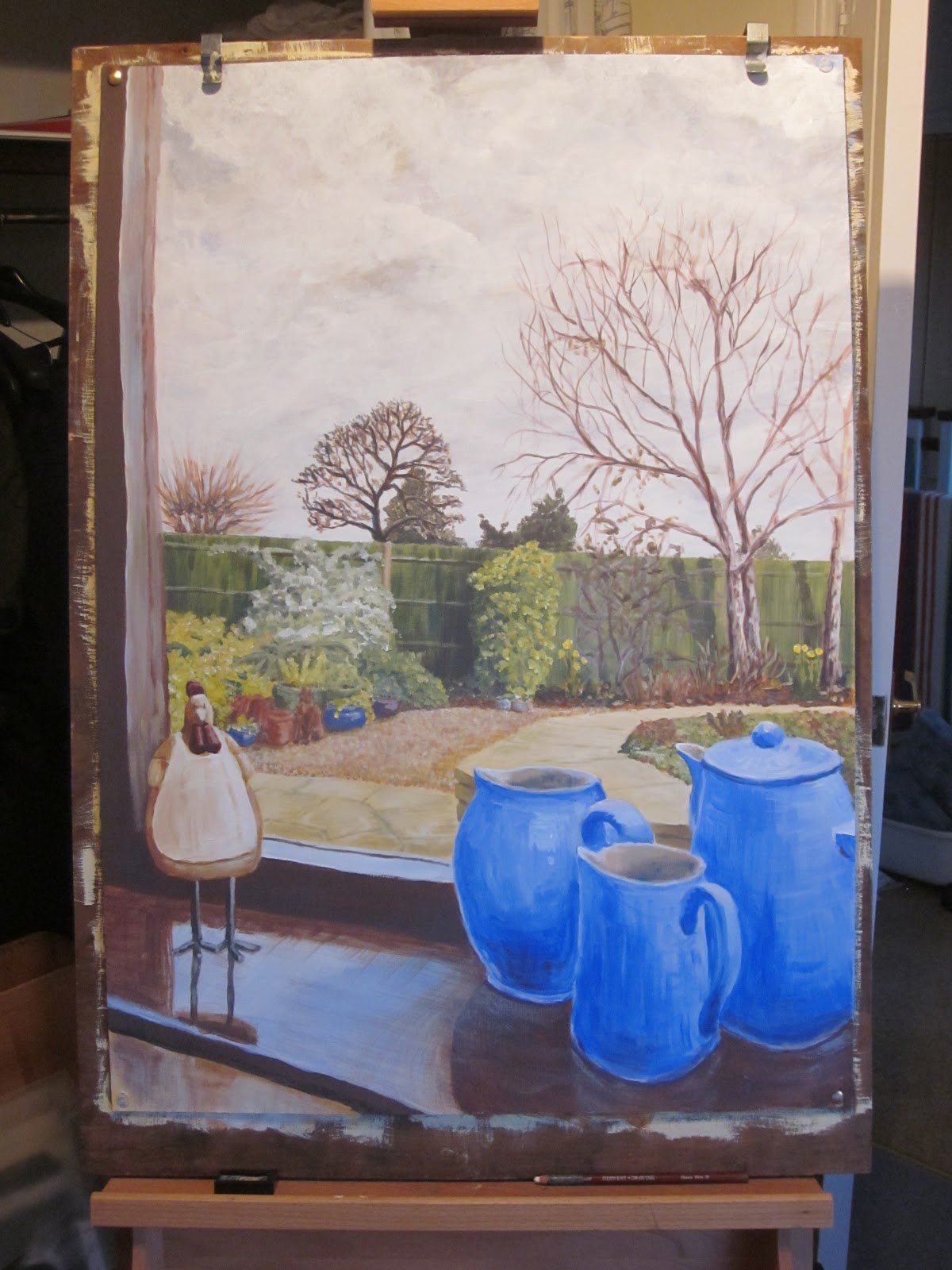
I started this blog in Nov. 2012 and have kept it open throughout this section of the painting module as I have continued to come across new examples of work that have been of interest.
My journey began with some images of the Japanese artist Utagawa Hiroshinge (1797-1853) whose prints I have been interested in for some time and contrasted this with a look at a contemporary perception of landscape in the yellow pages adverts. From here I took a more academic approach. I researched via an initial desk top study of readily available reference sources (see above) followed by a visit to the National Gallery in London where I collected some examples that expressed my understanding of early western development in landscape painting.

 This took me through a period from the 17th century to early 20th century. I selected examples by Hendrick Avercamp (1585-1634), Meindert Hebbema (1638-1709), Canaletto (1697-1786), John Constable (1776-1837), JMW Turner (1775-1851), Camille Pissarro (1830 - 1903), Claude Monet (1840-1926), Vincent van Gogh (1853-1890), Paul Cezanne (1839-1906) and Akseli Gallen-Kallela (1865-1931). I liked the storey value of the Avercamp with the imagined illustration created from detail studies of people and places. The winter scene too created both a historical and emotionally charged atmosphere. Hebbema's and Canaletto's views were fundamentally single point perspectives using man made structures (i.e. road and canal respectively) drawing the viewer's eye into and around the pictures. Canaletto's style was very precise almost photographic creating a completely different feeling of light and space to the Avercamp and Hebbema works. Constable's style appears more relaxed to that of Canaletto and more in keeping with the nature of the English landscape. Constable's composition and skill at colour mixing produces a realistic scene that can still be glimpsed today.
 Vincent van Gogh's expressionist approach conveys energy. His use of bright colours and strong textural marks have feeling and produce an emotional reaction. I enjoy his work and manner in which he distorts reality. When looking at his work it often raises the question in my mind of "where does drawing stop and painting begin?". There is obviously an overlap and van Gogh appears to span this zone. Paul Cezanne although of the same generation as the impressionists, developed his own approach independent of others. Gombrich in his "The Storey of Art" suggests that Cezanne questioned the impressionist approach "Where was that striving for a harmonious design, the achievement of solid simplicity and perfect balance which had marked the greatest paintings of the past?". His work appears flat and patterned but still manages to convey a feeling of place. His mark making/brush stokes although defined are in my mind more painterly than drawn as in van Gogh's work.
 In the example of Camille Pissarro's work I have selected he has used the impressionist approach to reproduce a wet evening townscape. He has taken an aerial perspective view looking down into the Paris street below the viewer's eye level. Again the impressionist approach has captured the atmosphere of the place without the need for fine detail. A more serene view has been produced by Akseli Gallen-Kallela of a still reflective lake. Here a realistic view has been recreated with a calm and cool atmoshere. The artist has chosen a high horizon which helps to emphasise the vastness of the lake.
In addition to the Tate Britain exhibition of Turner's studies, a visit to the Coutard Gallery enabled me to inspect the exhibited "plein air" studies by Georges Seurat (1859-91) using oil paint on small boards. Both these exhibitions helped to appreciate that experimentation and studies are for the artist's personal benefit. They are not intended to be finished works or for public display. They are a place to explore, play and challenge. With this in mind I am attempting to expand my sketchbook mark making to contain a higher percentage of experimentation and observation than complete pictures.
 As I have progressed through the exercises in Part 4, I have gone back through examples of other artists' work I have acquired from earlier exhibitions, I have attended new exhibitions (e.g. Tate Britain's exhibition "Looking at the view", Feb 2013) and investigated artists that I have become aware of. Within that list are examples by Spencer Gore, L.S. Lowry, Julian Opie, David Hockney, Gustav Klimt, Anthony Eyton and Ton Schulten.
I enjoy Lowry's work which although often of bleak views make me smile at his somewhat naive approach. In this river scene he has created a feeling of depth through his use of colour, fading it into the distance and by reducing the scale of buildings as they recede into the background.

 The manner in which Spencer Gore had abstracted the observed shapes in the landscape around Letchworth in Hertfordshire attracted me to this example of his work. Comparing this with the contemporary interpretation of a landscape by Julian Opie, there is more detail and feeling of energy in Spencer's image. Opie's minimalist approach and choice of hues in his print creates a feeling of peace and calm.
 Anthony Eyton appears to be able to capture the light and atmoshere in his landscapes. His style appears to be impressionistic in approach using broad brush marks denoting shadow and tonal variations caused by the sun and reflected light. David Hockney has used the route/road theme over the years as a key compositional feature. In his exhibition at the RA "A bigger picture" he demonstrated how his approach has changed over his lifetime to date and how his technical ability can be applied through the use of linear and aerial perspective.
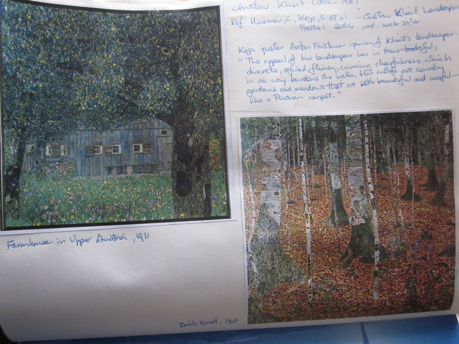
Gustave Klimt and Ton Schulten are two artists that were brought to my attention through my wife's textile work. Both artists use colour in exuberant ways with Klimt's eye for detail contrasted with Schulten's focus on imagination and pattern. I like the expressionist approach of Klimt which is in my view is more painterly than van Gogh's strong marks.
It is clear to me from my research to date that there are infinite opportunities presented to the artist to exploit the way that human brains try and link images to individual's experience of seen objects/views. Thus a painting whether it be an artist's illusion of reality, a dream or an idea may be enjoyed as pure pattern, juxtaposed colours and/or representation of a real place.