Tuesday 27 March 2012

Assignment 2

I chose to use the four man-made objects I had used in earlier studies for the still life subject of this assignment. I set up the objects in my studio placing them on a board on a table.

For my first study I prepared a collage with mono-chrome pen and ink background. In the image I tilted the board creating a false perspective and used magazine text to add tone to the board. I was pleased with the contrast between the coloured foreground and predominantly black and white background.


Using a pencil study in my A6 sketchbook, I worked out tonal qualities of the still life and the impact on its composition. I prepared the sketch from memory whilst travelling on a train into London.


I continued with a colour study in my approx A4 sketchbook returning to the blue and orange contrast combination I like. I used this study to experiment with applying acrylic paint to with a palette knife to add texture to the tall vase. I also experimented with acrylic gloss medium adding this to the "Mother Hen" and jug. By only using the gloss medium on two objects in the still life I discovered that the effect was to confuse the painted highlights from the reflections off the gloss medium.

I felt the view adopted so far was too similar to that used for earlier exercises so I changed my view point and working in my sketchbook produced a new line sketch to which I tried out colours.
Having decided on a the view point for my composition I proceeded to block out areas on my prepared support with acrylic washes.


I gradually build up the tones and hue mixes on the foreground objects. I wanted to maintain a warmth and true to scale proportions to the perspective overall. I also wanted to create a feel of interest beyond the view painted - what was behind the doors? what was Mother Hen looking at?

I, therefore, adjusted the doors so that the left hand door appear to be partially open and increased to brilliance of the table's orange finish. On reflection I realised the table's hue was drawing the viewers eye away from the main subjects. Also the tall vase appeared lost against the background.

I toned down the table to a more realistic colour and added warmth to the vase to help it stand out. I adjusted the hue of the vase further to increase the contrast between it and the jug by lightening the vase. Finally I modified highlights to the objects and added reflection to the picture in the background. I am particularly pleased with the quality of light that I have created within the picture.


By showing more of the room in which the still life was set up the composition has become busier and has created a storey beyond the man-made objects. As an illustration that effect may be useful. However as an image in its own right, I prefer the focus more on the sill life subjects as created in an earlier exerice. Framing the work helps to improve the focus too.

Compared to my work for Assignment 1, I believe I have improved the composition and my use of colour. I have stretched myself further too in exploring how to paint interior perspectives.


Monday 26 March 2012

Drawing and Painting Interiors

I visited the Fitz William Museum in Cambridge and the National Gallery in London to view works by Johannes Vermeer and his contemporaries. I particularly liked "The Music Lesson" and "Lady seated at Virginals" as examples of interior perspective in which he has captured the effects of light through his use of tone. In both pieces he has used windows as a source of side lighting and tiled floor pattern to enhance to the feel of perspective. Your eye is drawn to the person in the composition which provides a point of rest and focus.


Working in my study, I prepared a number of pencil perspective sketches of my own, both from standing and sitting view points.
The use of perspective within the closed room draws the eye into the composition. The space I have chosen is quite busy with many objects on work surfaces and shelves making it harder for the eye to rest on any particular object. The sketches were prepared fairly quickly with a simple indication of tone through the use of cross hatch marks.


Including the window in the composition as Vermeer has in some of his images, provides a visible light source. It also suggests a link with another space beyond the room creating a sense of mystery.

The view from the study across the hall towards my kitchen seems to draw the eye through the space with nowhere to rest and focus. The open door draws the eye into the middle space which is quite a complex space with the staircase, stairwell and doorways leading into other rooms.

I decided to paint the view into the hall as I found this the most challenging subject. I sketched out the composition onto a prepared support and started blocking in the main areas. In order to capture the colour of the hall ceiling I experimented with blue greys and orange/brown greys as there was reflected colour from sunlight and the carpet. Ultimately I settled on a cool blue grey but am still not happy with the outcome. The composition also made me feel uncomfortable as my eye had nowhere to rest. I therefore added a blue coat and shoes in the hallway which I feel succeeded in creating sufficient focus. On completion I realised that I had not got the perspective of the picture frames correct neither had I achieved sufficient contrast in tone or brilliance between the three zones of foreground (study), middle ground (hall) the distance (kitchen and landing). Technically too I found that controlling a paint brush less responsive than a pen or pencil so the marks defining edges are not as straight or even as I intended.
 

Friday 23 March 2012

Colour Relationships

I continued to use the same reference sources for this Project as I did for the first part, "Understanding Colour".

Itten (1973) discusses seven colour contrasts: hue, light-dark, cold-warm, complementary, simultaneous, saturation and extension. From my own experiments, I was able to recognise greater contrast between the yellow and dark blue-green than where the yellow was surrounded by a yellow-orange or yellow-green. Here the colours close to each other on the spectrum were appearing to cancel each other out. The complementary contrast examples I used, of yellow surrounded by violet and violet surrounded by yellow created an effect where the smaller square of colour appeared to sing out from its complementary. Using a neutral grey it was possible to set up simultaneous contrast effects with the grey appearing tinged with the complementary of the surrounding hue. Then using a large red circle I produced a successive contrast effect. Itten (1973) provides examples where varies artists have exploited the effects of contrast. I was able to observe how David Hockney has used these contrast effects with great skill and experience at the recent "A Bigger Picture" exhibition at the RA. In so doing Hockney has created spectacular landscape images that sing out and are able to express the changing seasons and changing light throughout the day in the Yorkshire countryside.


For the "Still Life with Complementary Colours" exercise I decided to continue to study the man made objects from the previous "Still Life" project. I have a tendency to work with blue and orange/yellow complementary colours so I chose to work with yellow and the complementary purple for this exercise, using white and mixtures of the hues to create tone and colour contrasts. I worked in my sketchbook for speed. I discovered I was tending to create a grey hue as I attempted to darken the tones and needed to add more yellow to keep some warmth in the hue. I was pleased with the tonal quality of this study and note that my choice of hues has created a cool image.


Whilst working on this exercise I had the opportunity to try my hand at lino cut printing. Using the the same still life theme I cut the image then experimented with colour mixing using the "Chine Colle" technique.
The lino cut process encouraged me to work more loosely and naively. The mark making was bolder than I would normally create in paint which I enjoyed. I believe I could probably produce a similar effect with paint using a sick rather than paint brush.

Wanting to explore the emotional response to my work, I chose the exercise  "Still Life with Colour used to evoke mood". I also wanted to explore the impact of playing with the objects' proportions and juxtaposition on the overall composition. Itten (1973) asserts that specific colours generate particular emotional reations and relates this to particular works of art. I wanted to create warmth and a degree of familiarity with the objects.


I produced some studies in my sketchbook before deciding on creating an image on a square support, in this case acrylic paper. I had originally started out in a more abstract manner but found I was drawn back to trying to reproduce the still life more accurately. I built up the composition working on the background and still life objects at the same time. I avoided using black and restricted my pallet thus creating a more harmonious outcome.

As the image developed I adjusted the colour of the background and "Mother Hen" figure as well as the alignment of the junction of surface and wall. Initially I planned to restrict the composition to three objects but felt there was something missing having carried out prior studies with a set of four objects. I therefore added the fourth object but at a reduced scale to balance the composition.


Comparing my studies of this group of man made objects, I am surprised by the range of effects I have been able to create even though they have developed over a number of weeks. Playing with the scale of the objects created interesting compositions enhanced by the juxtaposition of different hues. I have noted that by varying the chose of colours I can turn the outcome form a cool to a warm image and that by adding tone creates depth and a feeling of perspective.

Friday 16 March 2012

Close to Home - Still Life

I was not sure if there was going to be sufficient interest for me in studing still life subjects but discovered that in the process of searching out interesting objects I was encouraged to view my home in a different way. I started by just sketching various subjects around my home not limiting myself to just still life.

I found this very liberating and fun. I worked with pencil sketches, some with water colour washes and also oil pastels. I found I was seeing and becoming more aware of the every day objects all around me - an infinite number of jewels that could be explored and observed in varying lighting conditions throughout the day.

My children have moved to their own homes but my daughter's bedroom still retains a flavour of her character and contains groups of objects that make me smile. Soft toys and novelty items sit on shelves and other surfaces sharing memories and providing compositions with stories of their own.

Sketching cut flowers exposed me to the aging process of the individual plants. Coming back to the flower arrangement several days after the initial sketches offerred new subjects as yet unexplored.

On receipt of the feedback to Assignment 1 from my tutour I researched, as suggested, the work of Patrick Caulfield (1936 - 2005) and Giorgio Morandi (1890 - 1964). I like the clean lines and even blocks of colour produced by Caulfield in his screen prints. Although I enjoy their simplicity and the associated happy memories of growing up with Pop Art images , I do not see this as a style I want to develop myself. I did however, use this research as inspiration for collage experiments i.e. Bottle on Green Background" and "Mother Hen".


I selected approximate compementary coloured paper from old magazines. Then using one colour for the image and its complementary for the background. To enhance the object I added a black ink outline with a fibre pen and an indication of tone. A single horizontal line behind "Mother Hen" places the object in space. I have subsequently added horizontal, vertical and diagonal black lines to the "Bottle on Green Background" to stop the object appearing to float in space and now it appears to be in a corner (see sketchbook). From this study I went on to reproduce a group of bottles in blue/orange complementary acrylic colours (the colours have not reproduced very well in this blog).


Having completed these early studies I was ready to progress with the "Drawing in Paint" and subsequent "Still Life with Natural Objects" and "Still Life with Man Made Objects" exercises. I decided to follow my tutour's advice and avoid using black pigment for this series of exercises instead mixing the selected hues to achieve darker tones where necessary.


A selection of plastic ducks in my daughter's bedroom caught my eye and formed the basis of the first excercise. I undertook a series of studies before settling on a group of three; one yellow, one blue and one green.

Working on a watercolour paper support, I started by preparing  a ground of white emulsion paint mixed with a little cobalt blue. Onto this ground I drew the outlines of the three ducks and position of the shelf on which they sit with a light wash of paint. I then blocked in the approximate hues of the objects and background areas. I gradually built up the intensity of the hues for the ducks in layers. The green duck being created from a mix of the cobalt blue and orange yellow. Red was used to provide greater warmth to the background, darken the shadow below the shelf and form the orange for the beaks. Shadows and tone were created from blue and red blue washes. Finally highlights and eyes were added to bring the ducks alive.

The next exercice I chose was the "Still Life with Natural Objects". I selected some readily available objects from my kitchen, positioned them on a board and produced a few studies in my sketchbook. Working with pencil, pen, colour washes and acrylic, I studied tone, natural colour reproduction and experimented with composition.
Once I was satisified with the studies I prepared my watercolour paper support as before with a ground of light green as I would be working in reds and oranges. I built up the intensity of the hues adding layers using a moist brush for the smooth pepper and a dryer applied finish on the onion to enable under-layers to show through. Adding blue to the red of the pepper provided the tonal effect. The tonal effect to the multipal colours of the onion were more challenging and also more satisfying to create. I am however disappointed with the shadow cast by the pepper which feels too dense and laboured. The carrots were almost an after-thought but help to balance the composition.

Working with objects that had different textures and shapes as well as hue variations encouraged me to use different approaches to the aplication of paint in this exercise. I also focussed in on a part of the subject which created a more satisfying composition for this work. I was pleased with the final arrangement with the most complex object, the onion, in the foreground. However, I feel that by showing the edge of the supporting shelf in the ducks painting helped to position the objects better than I achieved in this exercise.


For the third exercise I chose "Still Life with Man Made Objects". I carried out a few stuidies including photos, pen and colour sketches before I turned to the work of Giorgio Morandi for inspiration.
 
I completed this exercise to approx. A4 size within my sketchbook so that I would work fast and not get too bogged down with perfecting the outcome. I was pleased with the painterly feel particularly the different tonal effect achieved in the background.
 
Compared to the previous exercise, I felt this was less overworked and still created interest in the hue variations and contrasts within and between the objects their foreground and the background. The shapes and textures of the objects in this last exercise were more complex and challenging than the choice of three similar ducks in the first exercise. I managed to introduce my desire for some fun in both the ducks and use of "Mother Hen" in the final exercise. I felt the exercise with the natural objects was a technical challenge but less motivating than the first and last exercise.

Tuesday 13 March 2012

Understanding colour

I started this blog in mid-January and although I have found the introduction to the history of colour theories very interesting and also another starting point when observing other artist's work, I became engrossed in background reading not wishing to complete the blog until I had finished my research! This has taken the form of desk top reading/reviews of three main reference books, i.e. 
  1. Anderson Feisner, E (2006) Colour - 2nd Edition, Laurence King Publications.
  2. Itten, J (1973 ed) The Art of Colour, John Wiley & Sons.
  3. Jennings, S (2003) Artist's Colour Manual, HarperCollins Publishers. 
plus "Google" web searches supported by further visits to Tates Britain and Modern as well as the Hockney exhibition at the RA. I have discovered there is much to learn about colour theory and its application. I can only hope to grasp the basic principles at this stage of my development and aim to increase my awareness over time.

I was familiar with the general principles of light from prior studies in physics and architectural design. I was also aware of the differences between mixing primary light colours and pigment colours. I now realise I have only scratched the surface in respect of colour theory and its application.

I feel I have begun to increase my awareness of different transparencies and colour bias of the manufactured pigments through experimenting with mixing and overlaying different hues. What has also been enlightening has been gaining a greater understanding about the impact of optical illusion and optical mixing  when mixing or positioning different hues next to each other. I recognise that although as individuals we see things differently, particularly for those who have difficulty distinguishing specific colours e.g. red/green "blindness, certain visual rules hold true irrespective of cultural backgrounds, age or gender.

As recommended, I researched Michel Eugene Chevreul (1786-1889) discovering that he was a chemist/dye master who investigated colour and its reactions with his findings being published in The Principles of of Harmony and Contrast of Colours, a reference document familiar to artists of the period. "He verified that all hues could be obtained from mixtures of the primaries red, yellow, and blue, but his greatest contribution was his recording of the reactions that colours have when placed side by side or in relationship to each other." (Feisner 2006). Chevreul's work led to the colour theory laws of simultaneous contrast, successive contrast and optical mixing. His research also led him to proposed colour harmonies for the production of colour schemes.

"Simultaneous contrast results from the fact that for any given colour the eye simultaneously requires the complementary colour and generates it spontaneously if it is not already present.....The simultaneously generated complementary occurs as a sensation in the eye of the beholder and is not objectively present." (Itten 1973).

"Successive contrast is the afterimage reaction that colours impart when the eye views them one after the other." (Feisner 2006).

"Optical mixing is the result of two or more colours mixing visually to..." appear to be "..another colour."   (Feisner 2006). The pointillist technique of George Seurat (1859-1891) used this optical mixing reaction to great effect.

It is understood that Chevreul's work influenced many artists of the period notably Delacroix (1798-1863), the Impressionists, Seurat (1859-1891) and other Neo-Impressionists as well as the American artist Winslow Homer (1836-1910).
From my own experiments:
  • When creating a grey scales, I have observed the optical illusion of mid-grey juxtaposed to white appearing darker than when juxtaposed to black.
  • When mixing pigments by adding white to the darker hues helps to maintain a consistent tonal value.
  • A greyish hue is created between orange and green blue i.e. a broken/tertiary colour.

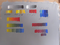
Creating my own colour wheel using mixes of my own pigments has helped me start to improve my ability to associate specific combinations of pigments with hues of varying tone. I have observed and experimented with the addition of titanium white to achieve more equal tones - more practice needed!

This process is helping me learn to mix hues with a pallet knife prior to applying rather than mixing with a brush wet in wet on paper as I have with water colours/washes for several years. I am also experimenting with different means of keeping the acrylics moist whist mixing and have found that a sealed Tupperware type plastic box with moist wick under grease proof paper seems to work.

I am now looking more closely at the work of other artists to see how they have applied these theories in practice. At the current David Hockney exhibition at the RA, I was able to explore how he has used the juxtaposition of hues to get effect in his landscapes of Yorkshire.